Grid system
naina uses responsive grid system, that is centered and has three grid escape options. All components added to this will automatically also be responsive.
How it works
While it might look less flexible, this grid system allows for almost any layout implementation due to its built in ability to use various column widths.
The standard width is the default one, all top level grid children will be sized to this. This default width size can be easily changed by setting one of the wide-1, wide-2 or full as the width of the row.
Same approach works for nested grid elements as well. The only important thing to remember is that in order for the grid sizing to stay consistent, the row that is the relative parent always needs to have a full width, just like the top-level grid.
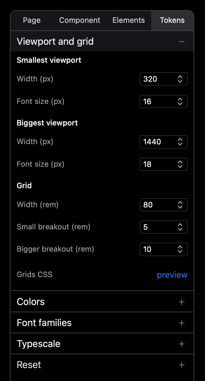
Each width size is configurable separately, as separate values in the Tokens section of the interface, under Viewport and grid.
There are also two settings for smallest and largest viewport widths, provided in pixels. These represent the lower and upper limits of screen size, beyond which the type and spacing will stop decreasing or increasing in size, to avoid too small or too large values.
