Typography and type scale
naina uses a A responsive typography scale, that prestyles default text types, for instance, all the headings and paragrahs, to a few pre-generated type sizes.
Managing type sizes
naina creates presets for span, p, h6, h5, h4, h3, h2 and h1 that are bound to sizing from -2 to 6, like in the below example.
| Element | Mapped size | span | Size -2 | p |
Size 0 |
h6 |
Size 1 |
h5 |
Size 2 |
h4 |
Size 3 |
h3 |
Size 4 |
h2 |
Size 5 |
h1 |
Size 6 |
|---|
You can at any time add smaller sizes than -2 or larger sizes than 6, and also delete those, but these presets cannot be deleted since they are the defaults that are mapped to the elements.
Managing type scaling and responsiveness
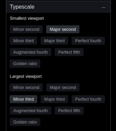
naina uses clamping for automatically growing each size step based on two scale factors you can choose and a body font size preset, that can be edited, so depending on the scale factors you choose, it will interpolate the size to an appropriate one for the screen size the text is diplayed one. THis eliminates the need for media quesries to resize text ans text scale becomes autoscalable.
Practically, you are able to set up the type growth scale for the smallest viewport and the largest viewport, everything in between will be interpolated for the user dynamically.

Font families
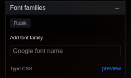
naina uses the Google Fot library for providing you with a choice opf fonts. In the future, you will also be able to upload your own fonts.
After you have chosen the families you need, they will be included in your system in a way which will offer higher loading performance than what including them direclty from the Google Fonts web page allows for.
