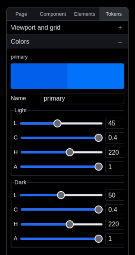
Colors
naina uses an OKLch color space due to its perceptually uniform lightness. Change your primary color once, every button and link styled as primary across your site updates instantly. Colors are organized by user actions to be practical and immediately usable.
The initial color setup
naina takes a different approach to color management than traditional design systems.
Instead of picking a primary color and various secondaries, naina asks you to define four action colors used for interactive elements like buttons and links.
These four colors are: primary, secondary, tertiary, and delete. naina selects initial values based on your industry, which you can customize later.
naina also generates 10 neutral colors derived from your primary color's hue, ensuring visual harmony across your palette.
All colors in naina use the OKlch color space, a mathematical color model that's currently the best choice for web design:
- Perceptually uniform - changing lightness by 10% looks like the same amount of change whether the color is dark or bright (unlike RGB/HSL)
- Predictable lightness - colors with the same L value appear equally bright to human eyes (HSL fails at this - yellow and blue at 50% lightness look completely different in brightness)
- Wide gamut ready - can represent colors beyond sRGB that modern screens can display (P3, Rec2020)
- Consistent hue - changing lightness doesn't shift the hue like it does in HSL
- Better gradients - interpolating between colors looks natural without weird muddy middle points
- Accessibility - easy to ensure contrast ratios by controlling the L value directly

Editing the colors
You can of course add neew colros and edit them the same way as the pre-defined ones. An important point to keep in mind is that that colors cannot be deleted for the moment. Given they are used by the system as CSS variables, deleting them would require a check for being used, which is a potential feature, if needed by the users of the product.